My first entry will be about the first project that I did, the design of a folie. A folie is like an art installation which is put on a site as a space activator. It can be anything. It can be abstract/fluid/solid or anything that we wanted. The criteria is that the folie that we design has to be in a box by 5mx5mx5m, and that it should have a specific function and can be used by at least 1 person.
Site
The site that was given for this project is the Howard Smith Wharves.
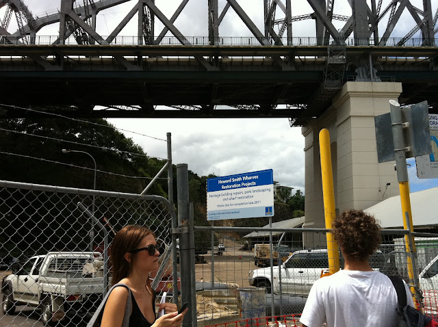
Here are some pictures I took.
 |
| Looking at the story bridge |
 |
| Near the fencing around the site. |
 |
| Just at the boundary. The actual site is beyond the bridge. |
These are just some pictures I took. After the site visit, I started thinking about a function that would be suitable for the site. Where the environment, especially the view of the river and the calm surrounding can be utilised in a unique way. I had an idea of creating a meditating space or to design the folie for meditation. Its just perfect for a surrounding like these as it disconnects the person from the busy life of the city. And the Howard Smith Wharves is nothing like the busy city.
Design Process
So hence, I started a bit of research on meditation. The first thing that I got interested in was the position of person while meditating. Its something like, that you site crosslegged and you pull your feet in such a way that it rests on your thighs.
Here a picture of the meditation position. This position is also called as the Lotus Position.
 |
| Taken from |
I wanted the meditating space of the folie to be designed in such a way that it follows the contour of the person. Like, the shape which broadens at the bottom and comes in to enclose at the top. I did some 3d work in Sketchup as well as some sketches.
 |
 |
| Study of the contour of the person and to create a form suitable for it. |
The form that I came up with was a curved formed; a two layered curved form. This form curves on both sides of the person while he/she is sitting inside it. It kind of creates a secure semi private space for him/her to mediate.
Here are some 3d renderings I did in Sketchup. These are just conceptual.
 |
| Different Views of the conceptual 3d Model. |
This was my initial idea for the design. However after the tutorial which was on the 3rd week, I thought about the reviews I got and decided that my design need to be developed further.
So I came up with sketches on how I can expand the design more, without changing the initial concept of the design. I maintained the curved structure but played around with it.
Here are some sketches I did.
I was not able to get a clear idea of what I wanted to get out of this by sketching. So I turned to 3d, where I can easily play around with it and at the same time see how it changes and makes a difference in different angles and views.
Here is what I came up with at last. For these Renderings I used 3ds max. I played with the light to see how it created shadows and overlays and layers as the structure is transparent.
So after the design was confirmed, it was the time for some technical drawings. I worked on the front elevation, back elevation and an isometric view of the folie. The drawings are to 1:25 scale.
After the 3d images and the Auto CAD drawings were ready, I began working on the presentation board or the A1 Poster for the exhibition.
This is the final A1 Poster.
That was the end of the first project Design of the Folie. It was a fun project, as the criteria was quite broad and we could design anything. I just wished that I got a little bit more time to work on the 3d renderings and to make the poster more nicer. But overall I enjoyed the project. It was definitely a good start.
:)
Cheers
So I came up with sketches on how I can expand the design more, without changing the initial concept of the design. I maintained the curved structure but played around with it.
Here are some sketches I did.
I was not able to get a clear idea of what I wanted to get out of this by sketching. So I turned to 3d, where I can easily play around with it and at the same time see how it changes and makes a difference in different angles and views.
Here is what I came up with at last. For these Renderings I used 3ds max. I played with the light to see how it created shadows and overlays and layers as the structure is transparent.
So after the design was confirmed, it was the time for some technical drawings. I worked on the front elevation, back elevation and an isometric view of the folie. The drawings are to 1:25 scale.
 |
| Left: Front View Centre: Isometric View of the Side Right: Back View |
This is the final A1 Poster.
That was the end of the first project Design of the Folie. It was a fun project, as the criteria was quite broad and we could design anything. I just wished that I got a little bit more time to work on the 3d renderings and to make the poster more nicer. But overall I enjoyed the project. It was definitely a good start.
:)
Cheers


hebat,,harap anda terus berjaya^^
ReplyDeleteHello,
ReplyDeleteMay I ask what software did you use for your A1 board?
Lovely design, btw. You're very talented